- Buyers judge your size and reliability from surface signals long before they meet you.
- The cause is usually an identity built for the launch-stage company, no visual system, or neglected maintenance.
- Audit every touchpoint in the order a buyer meets it, with one outside rater, and include the checks Gulf and Egyptian procurement teams make.
- Fix the documents your team sends in the first week of a deal before redesigning anything else.
The company has been trading for years. It has the team, the equipment, the approvals and a list of completed projects that would impress any buyer who saw it in full. Yet it keeps winning the small jobs and losing the large ones, often before a single meeting takes place. The feedback, when there is any, is vague: “we went with a more established supplier.”
Often the buyer never saw the real company. They saw a logo drawn fifteen years ago, a profile assembled from old slides, a website that has not changed since it launched and a proposal sent from a free email address. Together, those signals describe a smaller, younger and less organised business than the one that actually exists.
This diagnosis works through the symptoms, the causes that usually sit beneath them, and a touchpoint audit you can run before you decide whether you need a refresh, a rebuild or simply better discipline with what you already have.
The symptoms: how a brand that looks too small shows up
No one tells a supplier “your brand made you look small.” The problem appears as a set of commercial signals. If several of these sound familiar, treat them as one pattern.
- You win small and medium jobs but rarely reach the shortlist for larger contracts. Capability is not the issue; you have delivered similar work before.
- Your own team hesitates to send the company profile or the website link. Salespeople explain the company verbally instead, or send photos from their phones.
- Buyers ask, in one form or another, “how big are you, really?” They request project references, staff numbers or a site visit earlier than you would expect.
- Your materials look dated next to newer competitors. A company founded three years ago presents itself as more established than you do.
- Every document looks different. The profile, the quotation, the email signature and the vehicle livery each use a different version of the logo and different colours.
- Price becomes the only conversation. When nothing about your presentation signals scale or reliability, buyers fall back on comparing numbers.
The last symptom is the costly one. A buyer who cannot see why you are the safer choice will treat you as interchangeable.
Why first impressions carry so much weight before the first meeting
Buyers form a view of you long before they speak to you. Gartner’s B2B buying journey research, based on its surveys of B2B buyers, reports that buyers considering a purchase spend only 17% of that time meeting with potential suppliers; when they are comparing several options, the time spent with any one supplier’s sales rep may be only 5% or 6%. The rest of the decision is shaped by what they find, read and are sent.
Older speed-of-judgement studies on websites, now dated, point the same way (2006, 2002). The principle carries across every touchpoint: buyers use surface signals as a shortcut for questions they cannot yet answer, such as whether you are stable, organised and able to handle a contract of their size.
The likely underlying causes
A brand that looks smaller than the company usually comes from one of five causes, or a mix. Each needs a different fix, so naming the right one matters.
| Underlying cause | What it looks like in practice | Where to look first |
|---|---|---|
| The identity was built for the company you were at launch | A logo and colours designed quickly at the start, never revisited as the business moved into larger work | The logo file history and whether a full visual system ever existed |
| No system, only a logo | Each designer, supplier and sign maker interprets the brand differently, so nothing matches | Whether brand guidelines exist and whether suppliers actually receive them |
| The content lags the business | The profile and website still describe old services, old clients and old project sizes | The date of the last real update to the profile and the project list |
| Weak digital basics | Free email addresses, broken links, an outdated LinkedIn Page, no favicon, a site name that shows wrongly in search | The first three things a buyer sees after searching your company name |
| Physical touchpoints left behind | Faded signage, inconsistent vehicle branding, mismatched uniforms at site or at exhibitions | Photos of your office, vehicles and site teams taken this month |
The first two causes are about the brand itself. The last three are about maintenance, and they can usually be fixed without changing the identity at all.
The touchpoint audit: how to check each one
Run this audit as a buyer would experience you, in the order they usually meet you. Give each touchpoint a simple rating: represents us, acceptable or makes us look smaller. Ask one person outside the company to rate it as well; insiders stop seeing what has become familiar.
| Touchpoint | What to check | A red flag |
|---|---|---|
| Search results for your company name | The site name, icon and description Google shows; whether your own site appears first | A generic site name or default icon; an old directory listing outranks you |
| Website | Current services, recent projects, real address and phone, team or leadership, working links on mobile | Old news on the home page, broken links, typing errors, no physical address |
| Company profile | Current scope, project list with dates and values where you can share them, approvals and certificates, consistent design | Slides from different years, low-resolution images, clients you no longer serve |
| LinkedIn Page and leaders’ profiles | Logo, banner, description and recent posts; whether senior people list the company correctly | An unclaimed or duplicate Page, no posts in months, executives with blank profiles |
| Email and signature | Company domain, a single signature format, correct titles and numbers | Free webmail addresses, image-only signatures, five different layouts across the team |
| Proposals and quotations | A consistent template, clear structure, cover letter, terms and contact details | A Word file with a pasted logo, inconsistent fonts, no project references |
| Signage, office and showroom | Condition, lighting and consistency with the current logo | Faded or outdated signs, old logo still at reception |
| Vehicles, uniforms and site presence | Fleet livery, PPE and uniform branding, site hoardings | Unbranded vehicles next to branded ones, different logo versions on site |
Checks Gulf and Egyptian buyers make
Procurement teams in Saudi Arabia, the UAE and Egypt verify more than appearance. These rows are professional recommendations based on what pre-qualification and vendor files typically ask for; confirm the legal items with your adviser.
| Touchpoint | What to check | A red flag |
|---|---|---|
| Arabic version | The profile, website and quotation exist in Arabic, written to the same standard as the English | Machine-translated Arabic, or an Arabic page marked “coming soon” |
| Quotations and invoices | The legal name matches the commercial registration, and your VAT registration number appears wherever it is required. ZATCA’s VAT page states that a simplified tax invoice must be issued in Arabic and show the issue date, the supplier’s name and address, the items, the amount and the VAT value (checked 31 Oct 2026) | The trade name on the logo differs from the legal name on the invoice, with no explanation |
| Registration details | The commercial registration number (in Egypt, the commercial register and tax card numbers) on the profile and the quotation footer | A buyer has to ask for them |
| Address | A full physical address on the website and Google Business Profile; in Saudi Arabia, the National Address that buyers will ask for | A P.O. box only, or a map pin in the wrong district |
| Google Business Profile | Arabic and English names consistent with your signage; current photos of the office or site | An unclaimed listing, or one still under an old name |
| Leaders on LinkedIn | Buyers may search names in both scripts; titles match the company profile | The CEO’s profile still lists a previous company |
| Certificates and approvals | Current approvals shown with their expiry dates (civil defence, ISO, vendor registrations) | Expired certificates in the company profile |
For the document pack large Saudi buyers request, see vendor registration in Saudi Arabia.
Checks worth doing on the digital side
Some of the strongest size signals are technical and take minutes to confirm.
- Site name and icon in Google. Google generates the site name automatically, but it lets you state your preference with WebSite structured data on the home page. A favicon can appear beside your result if it follows Google’s favicon guidelines: it must be square and at least 8 by 8 pixels, and Google recommends larger than 48 by 48 pixels.
- Email authentication. Since 1 February 2024, Gmail’s sender guidelines have required everyone sending to Gmail accounts to set up SPF or DKIM for their sending domains, among other requirements; Google updates these rules, so check the current page with whoever manages your email. A proposal that lands in a buyer’s spam folder does more damage than a weak design.
- Credibility basics. Stanford’s web credibility guidelines recommend showing the real organisation behind the site (a physical address helps), making contact easy, keeping content updated and avoiding errors such as typing mistakes and broken links.
Common mistakes when trying to look bigger
Once the problem is recognised, there is a temptation to fix it with appearance alone. These responses tend to backfire.
- Inflating claims. Stock photos of glass towers, invented client logos or vague “regional leader” language may be checked during pre-qualification. Overstatement is worse than modesty because it fails under verification.
- Redesigning the logo and stopping there. A new logo on an old profile, an old website and an old email signature produces a brand that looks even less consistent than before.
- Rebranding when a refresh would do. If buyers already recognise your name and colours, you may need to tidy and extend the system rather than replace it. Test what customers actually recognise before deciding which you need; auditing your distinctive brand assets shows how.
- Fixing the screens and leaving the physical brand to chance. Signage, vehicles and uniforms that each supplier interprets differently undo the website the moment a buyer visits; a rollout plan with a touchpoint inventory keeps them in step.
What to fix first: a filled-in audit
Order the work by how early a buyer meets each touchpoint and how much it costs you to leave it.
Hypothetical example. A Cairo MEP contractor, trading for 15 years, is now bidding for Gulf projects. The managing director and one outside rater, a consultant engineer the firm trusts, score each touchpoint as represents us, acceptable or smaller (makes us look smaller).
| Touchpoint | Insider | Outside rater | Note |
|---|---|---|---|
| Search result for the company name | Acceptable | Smaller | An old directory listing ranks above the website |
| Website | Acceptable | Smaller | The project list stops years ago; no Arabic pages |
| Company profile | Represents us | Smaller | Slides from three different eras; no approvals page |
| Quotation template | Acceptable | Smaller | A Word file with a pasted logo, and no commercial register or tax details |
| Represents us | Acceptable | Company domain, but four signature styles across the team | |
| Site hoardings and vehicles | Acceptable | Acceptable | The old logo is still on two vans |
The gap between the two columns is the finding: the insider rated nothing “smaller”, while the outside rater rated four touchpoints that way. The fix order follows from it:
- The quotation template and email signature, because they go out with every bid and can be rebuilt without waiting for any wider decision.
- The company profile, rebuilt for pre-qualification, with an approvals page.
- The website’s project list and Arabic pages, using the B2B website checklist for the Gulf.
- Only then the identity itself. Decide whether the logo needs a refresh or a rebrand. If the audit shows it cannot carry the business forward, or there is no system at all, that is the moment for proper brand identity and positioning work: logo, colour and typography system, guidelines, profile and presentation templates built together.
- The physical brand last, with the vans and signage scheduled around natural replacement points as part of a rollout plan.
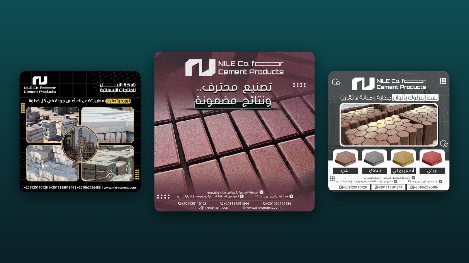
This is the kind of work behind our projects for Nile Cement, an Egyptian precast manufacturer for which we built an industrial identity, stationery and social designs, SafeCo Group, where the brand was extended beyond the logo into collateral, signage, campaigns, presentations and a brand film, and Egyptian Maritime Services, an established freight, shipping and customs company whose identity we refined and built into a company profile, stationery and a digital presence. In each, the brief went beyond the logo: one system applied across many of the touchpoints a buyer sees.
When an outside view helps
You can run the audit above internally. An outside view tends to earn its place when:
- The owners are attached to the current logo and the team cannot judge it objectively.
- You are preparing for a larger tender, a pre-qualification, a new market or an exhibition and need to know what to fix in what order.
- You cannot tell whether the problem is the identity itself or the way it has been applied.
- Several suppliers have produced your materials over the years and no one holds the master files.
If you would like a structured outside view of your own touchpoints, a business diagnosis session is a paid 45-minute one-to-one conversation that ends with clear next steps on brand, website and materials, whether or not you work with RX Designer afterwards.
Frequently asked questions
How can I make my company look more professional quickly?
Start with what buyers see first: a consistent company profile, a proposal template, a single email signature on your company domain, and a website home page with current services, recent projects and a real address. These usually matter more than a new logo.
Do I need a full rebrand to win bigger clients?
Not always. If buyers already recognise your name and colours, a refresh that builds a proper system around them may be enough. A full rebrand makes sense when the current identity cannot carry the business you have become or the market you are entering.
Which touchpoints should a B2B brand audit include?
Search results for your company name, the website, company profile, LinkedIn Page and leaders' profiles, email and signatures, proposals and quotations, signage and offices, and vehicles, uniforms and site presence.
What do Gulf and Egyptian buyers check on a supplier's documents?
Beyond appearance, procurement teams look for an Arabic version written to the same standard as the English, a legal name that matches the commercial registration, registration and tax details on quotations, a full physical address (the National Address in Saudi Arabia) and current approvals with expiry dates. In Saudi Arabia, ZATCA requires simplified tax invoices to be issued in Arabic.
Does email setup really affect how professional we look?
Yes. Free webmail addresses and inconsistent signatures signal a smaller operation, and since February 2024 Gmail's sender guidelines have required everyone sending to Gmail accounts to set up SPF or DKIM for their sending domains. A proposal that lands in spam is never read. Check Google's current guidelines, as the requirements are updated.
- Gartner, The B2B Buying Journey.
- Nature News, Web users judge sites in the blink of an eye (2006-01-13).
- Consumer Reports Advocacy (study prepared for Consumer WebWatch), How Do People Evaluate a Web Site's Credibility? (2002-10-29).
- Stanford Persuasive Technology Lab, Stanford Guidelines for Web Credibility.
- Gmail Help, Email sender guidelines.
- Google Search Central, Provide a site name to Google Search.
- Google Search Central, Define a favicon to show in search results.
- Zakat, Tax and Customs Authority (ZATCA), Value Added Tax (VAT) (2026-10-31).