
Case study · Building materials
Strength you can
build on.
Nile Co. for Precast Cement Products manufactures interlock pavers, curbstones, solid bricks, hollow blocks, hardstone, terrazzo tiles and steel-crete units across three production sites in Egypt — Abu Rawash, Badr and Suez — to ES 14382 and ASTM C936 standards. RX built the brand system and runs the content that puts those products in front of contractors, developers and engineers every day.
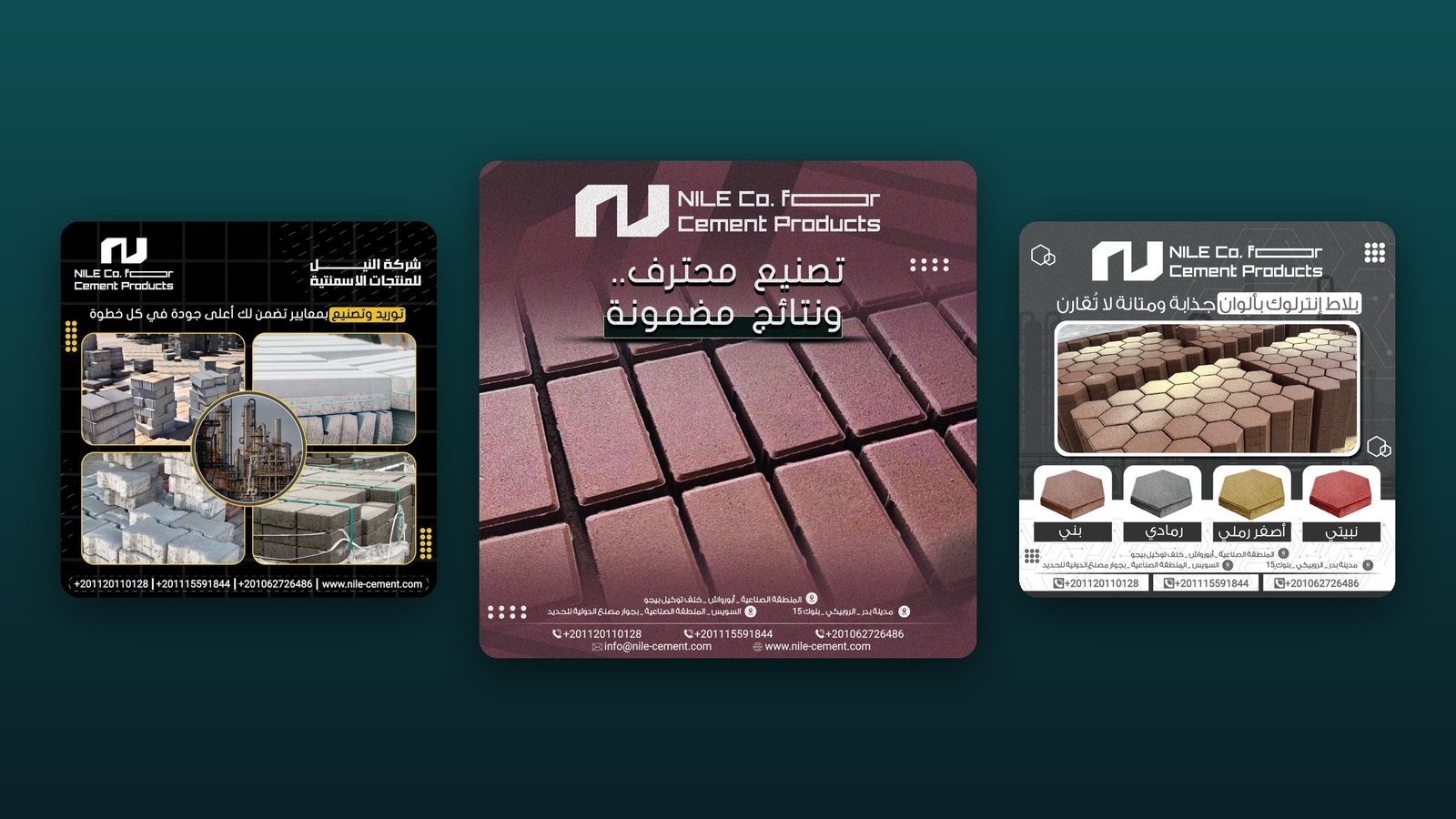
A commodity market.
A brand that stands out.
Precast products all look alike in a supplier’s feed: grey blocks on a pallet and a phone number. Contractors and developers buy on quality, consistency and on-time delivery — so the brand had to prove all three, visually, before the first call.
Nile needed one recognisable system that could carry a high volume of content — product by product, colour by colour — without ever looking repetitive.
From the mark
to the feed.
Identity system
Primary and secondary logo lock-ups in Arabic and English, a teal colour system, concrete textures and a technical type style.
Content strategy
A monthly calendar built around the product line — interlock, hexagon, curbstone, hollow blocks — plus quality, delivery and factory stories.
Design production
350+ social designs across rotating visual series, so the feed stays fresh while every post is instantly Nile.
Business tools
Business cards, letterhead and company-intro posts for sales and tenders.
Every product,
its own hero.
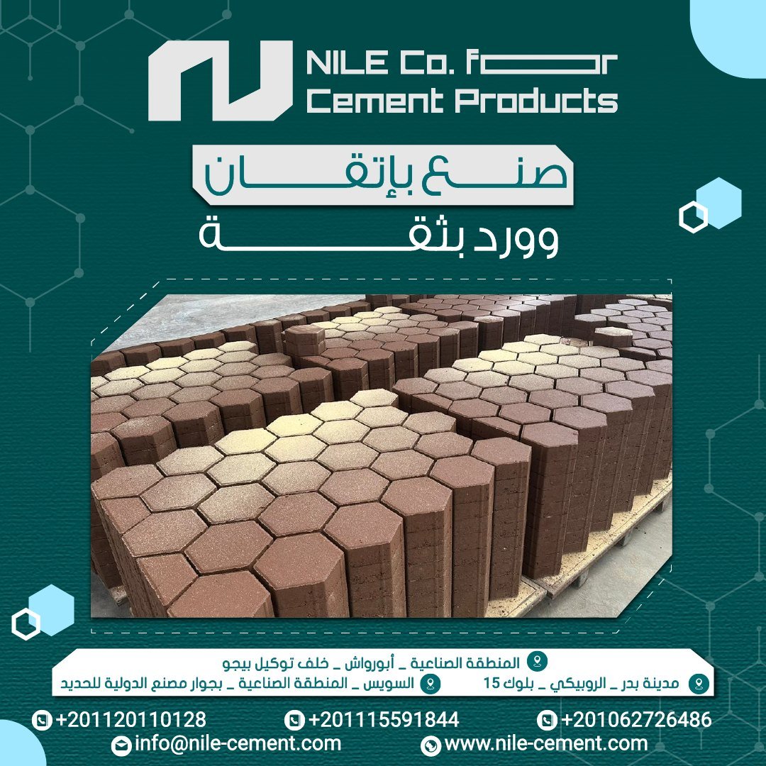
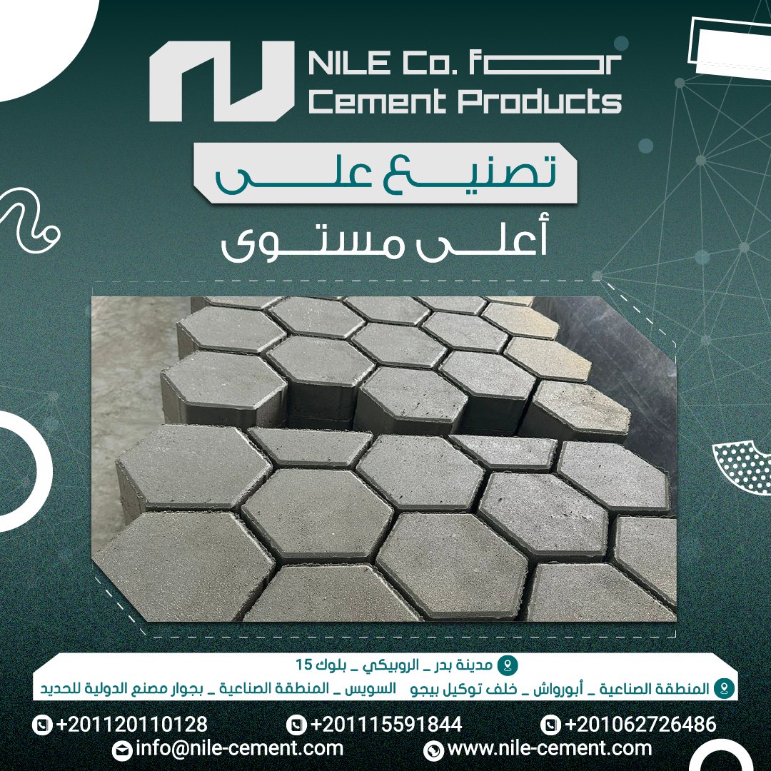
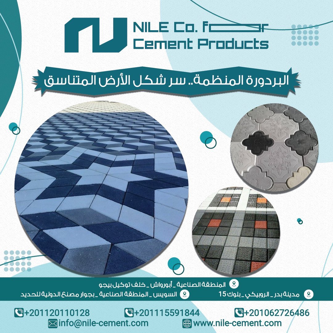
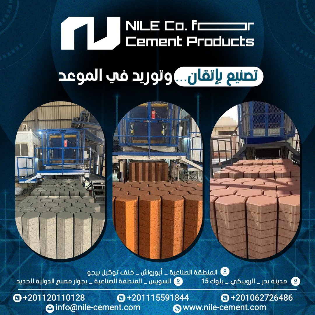
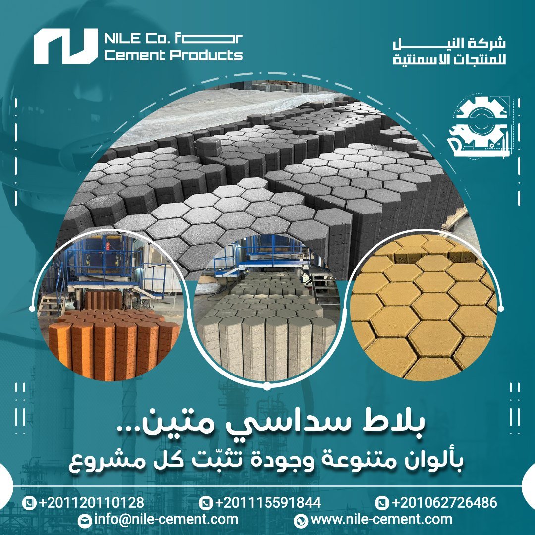
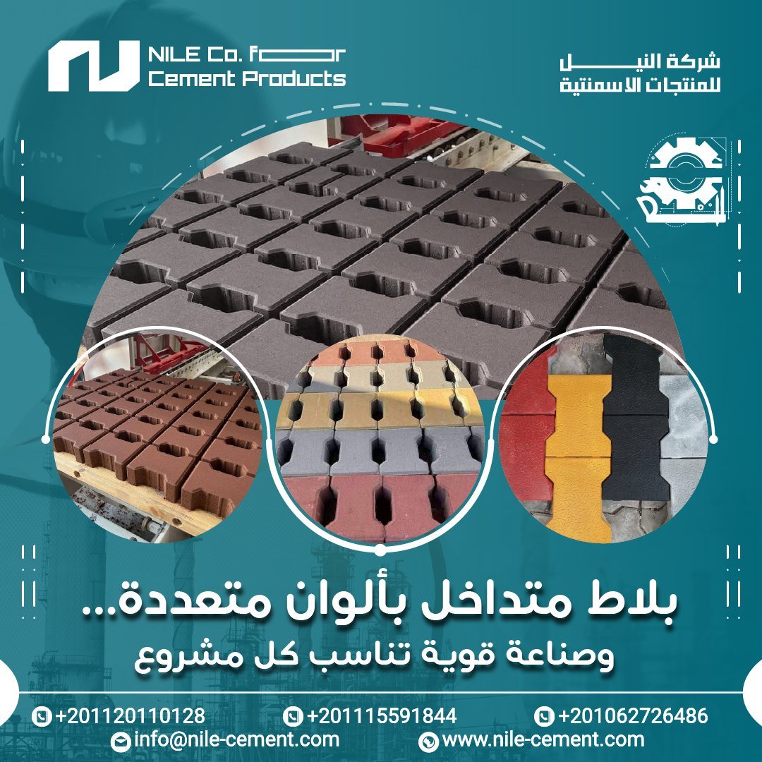
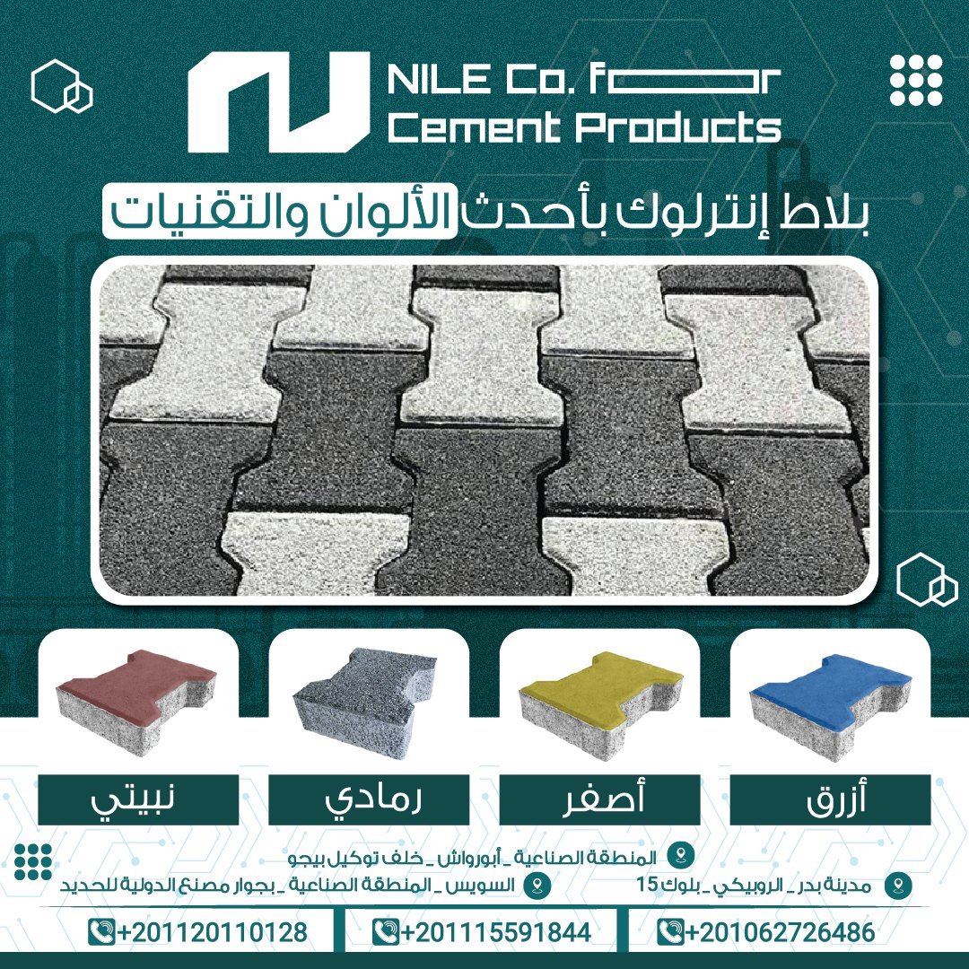
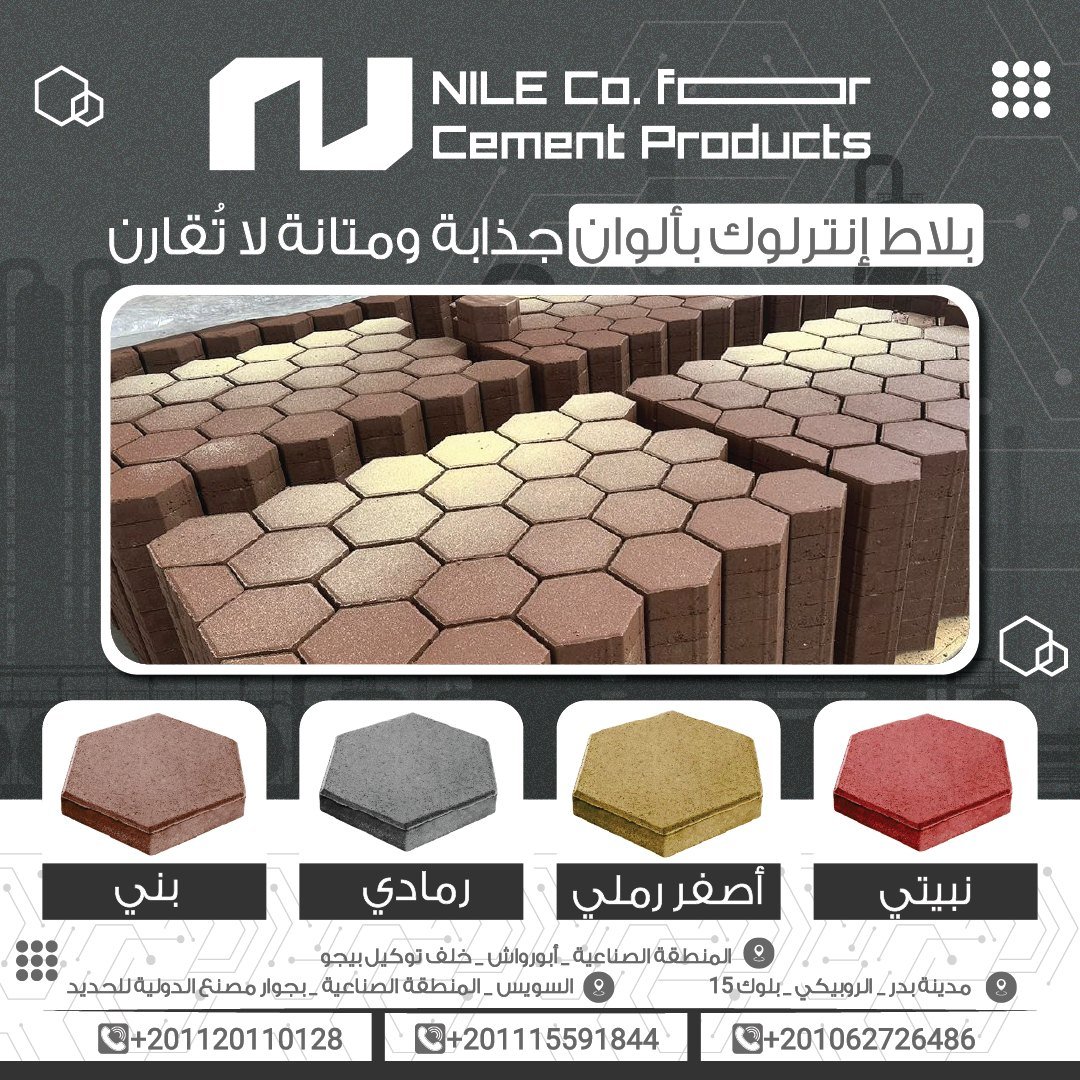
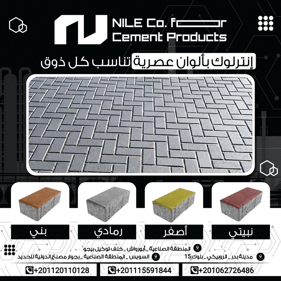
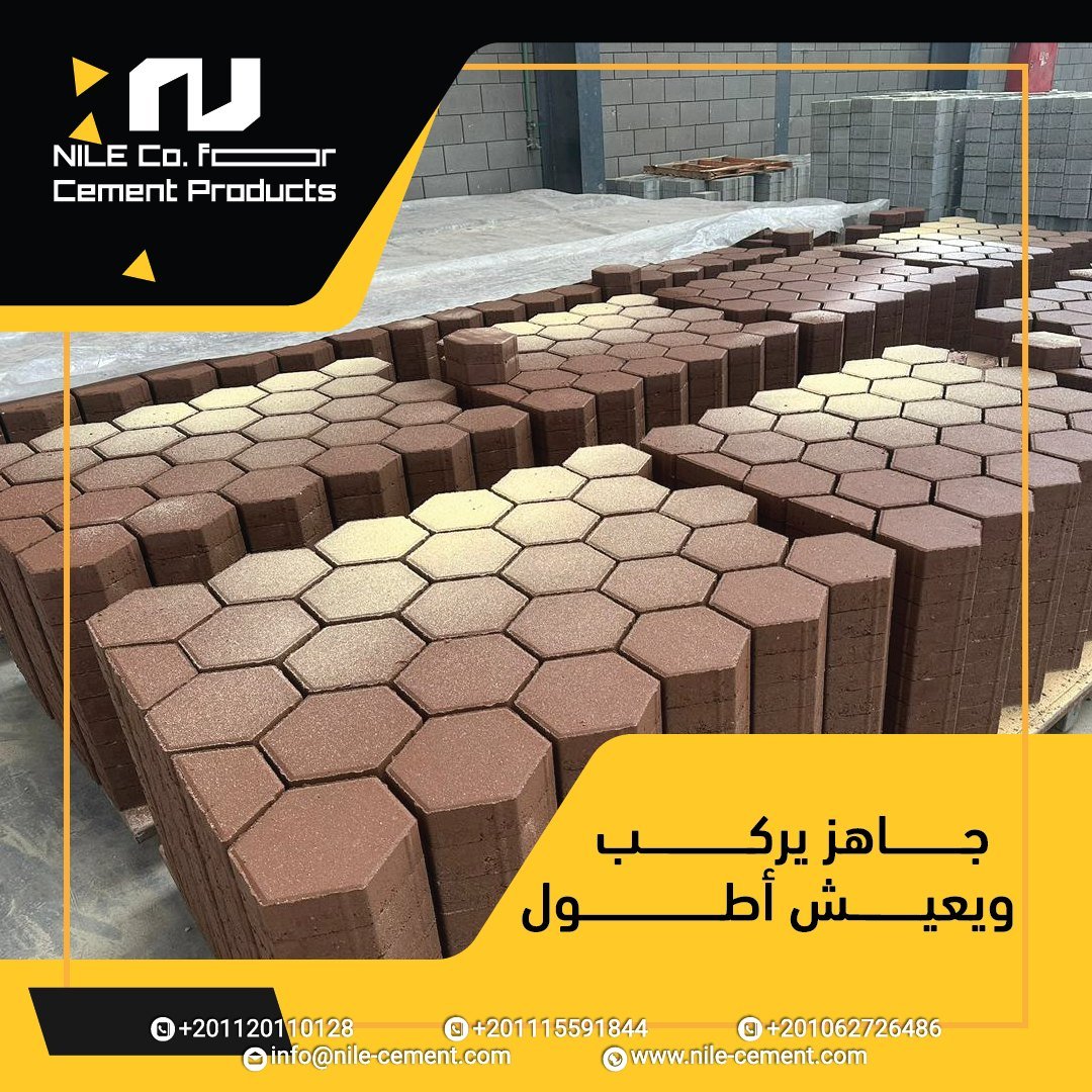
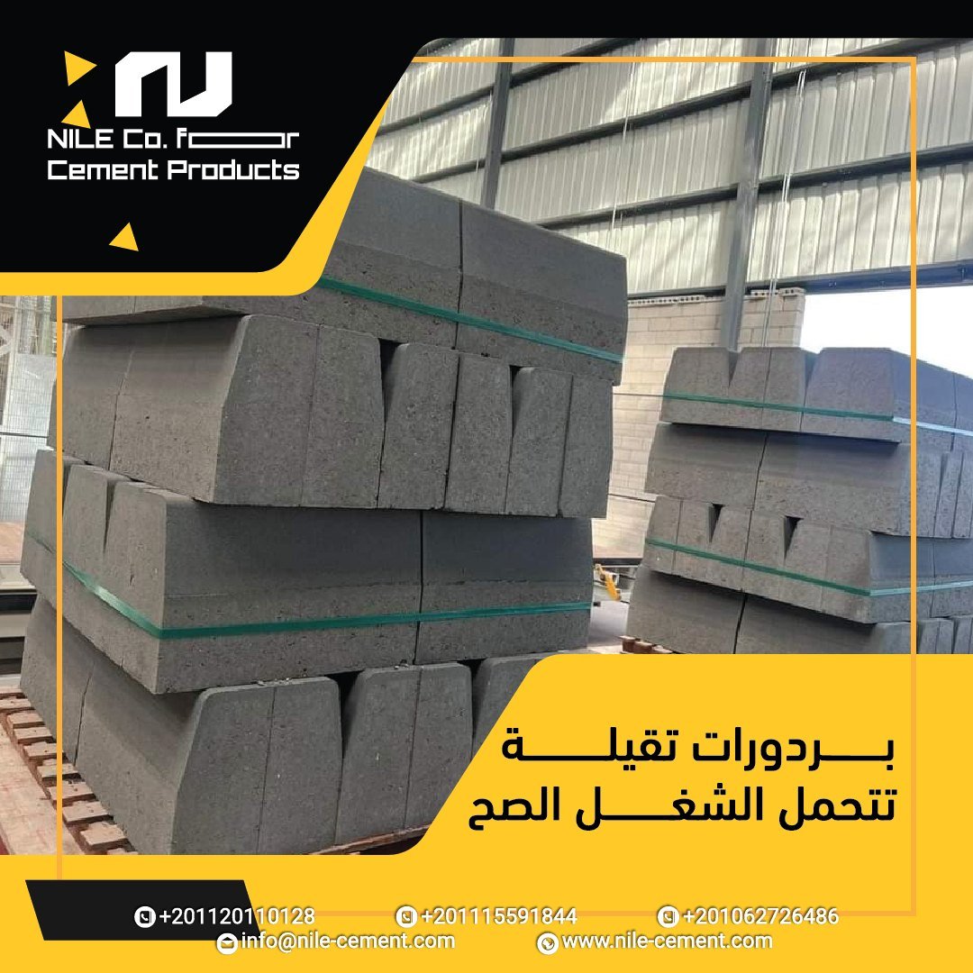
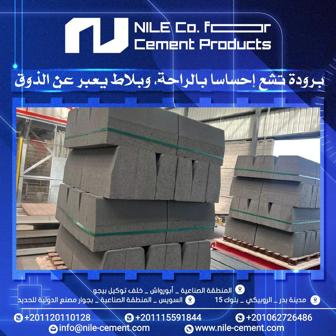
Real factory photography turned into clear product posts — shape, colour range and the promise in one line: precise manufacturing, on-time supply.

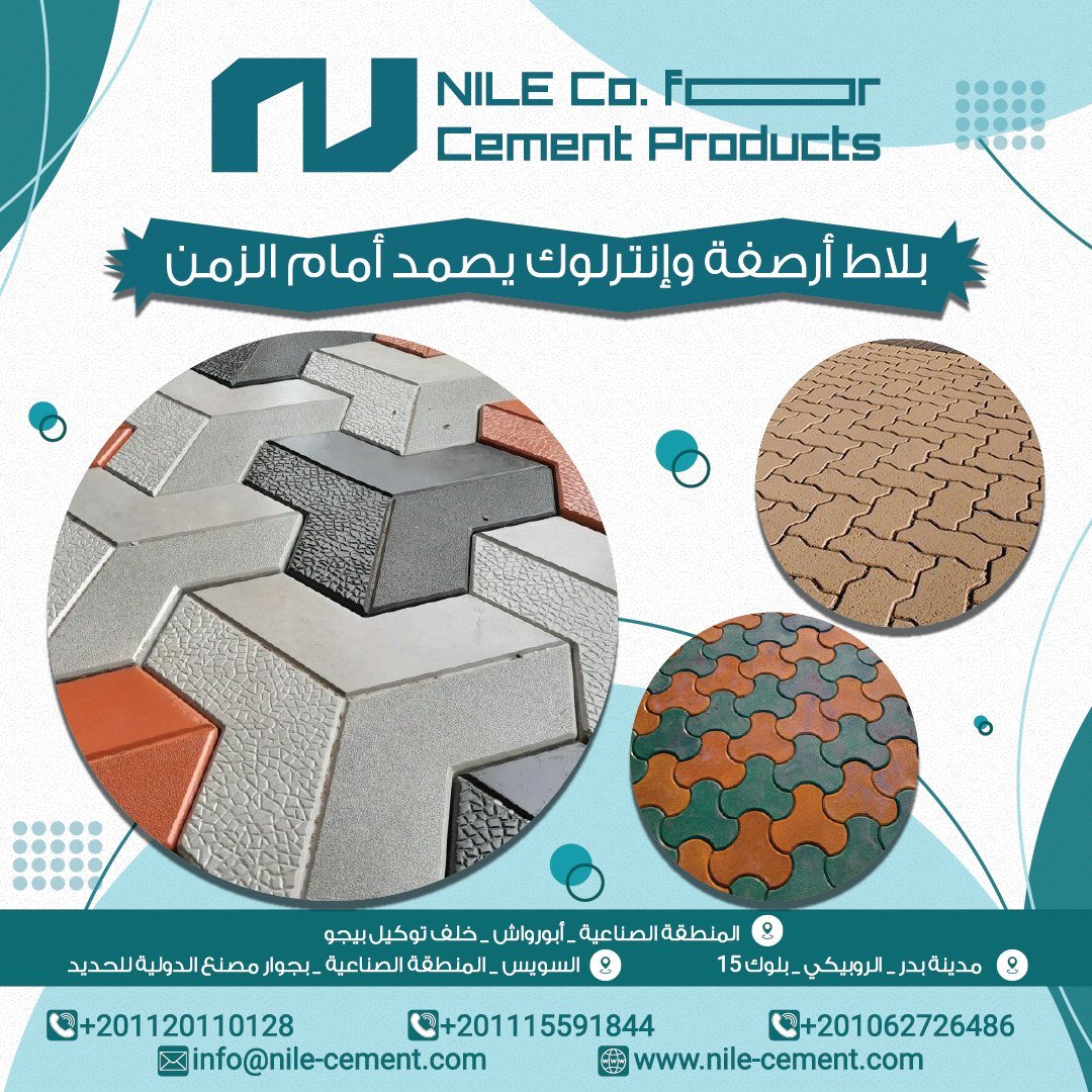
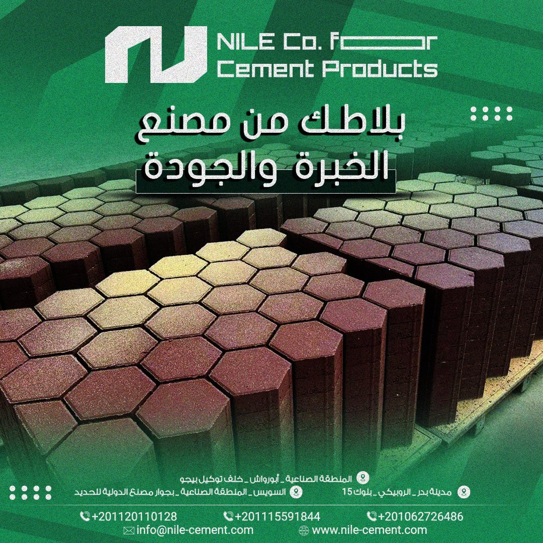


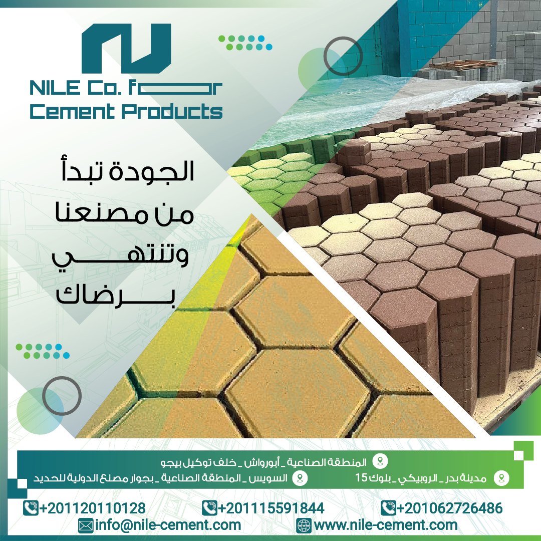
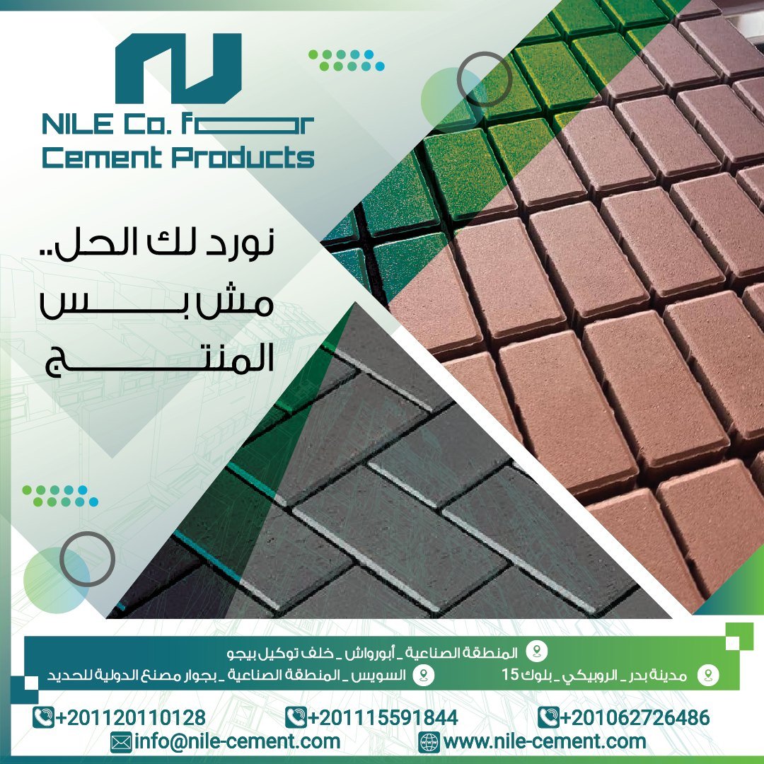

Fresh looks.
Same brand.
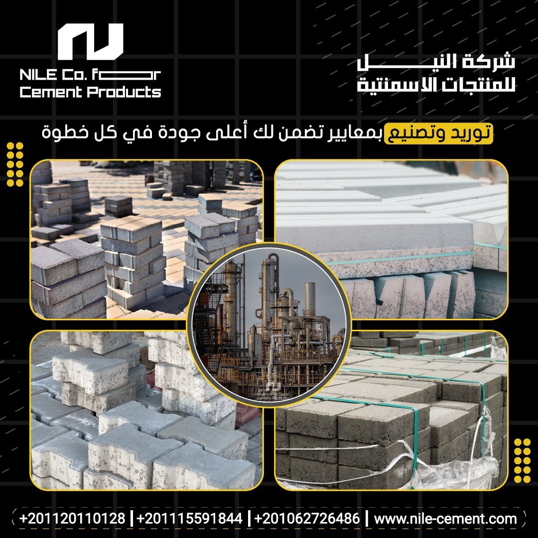
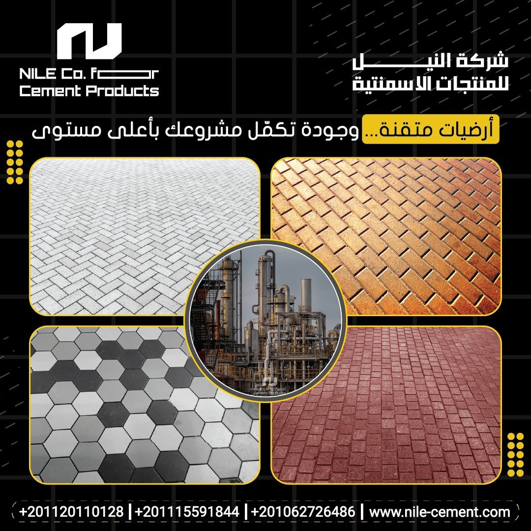
Rotating visual seasons — black and amber, deep blue, green and cobalt — keep a high-frequency feed from going stale while the logo, footer and contact system never change.


A mark that reads
on concrete.

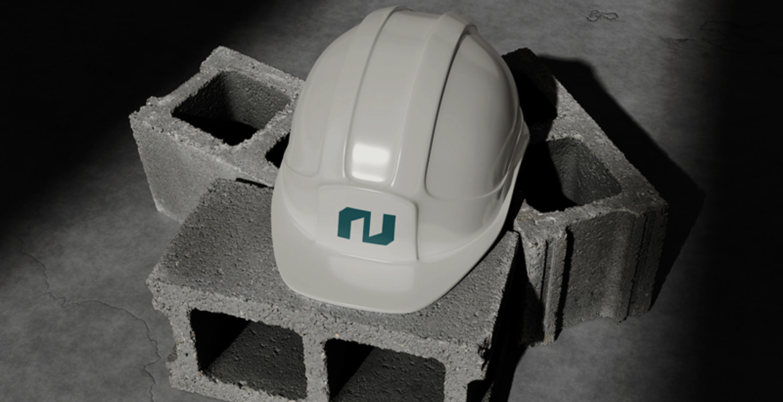
On site and
on screen.

Solid, on every
touchpoint.
A steady, high-volume feed delivered on one consistent system.
Content written for contractors, developers and engineers — product, spec and delivery first.
A clean teal mark that reads on the site, the card and the screen.
Related
reading.
A factory's identity is on its packs, trucks, delivery notes and dealers' signs. Change it without a plan for the channel and buyers start asking whether the product is still the same.
Read InsightWhy Your Brand Looks Smaller Than Your Company Really IsEstablished firms often lose larger contracts before the first meeting because their logo, profile and website describe a smaller company. Here is how to diagnose it and what to fix first.
Read InsightRebrand or Refresh? A Decision Framework for Established CompaniesFor companies that have traded for 15 to 30 years, recognition is the asset at stake. Here is how to test what customers actually remember and which business changes justify spending it.
Read