
Case study · Brand identity
Fresh from
the branch.
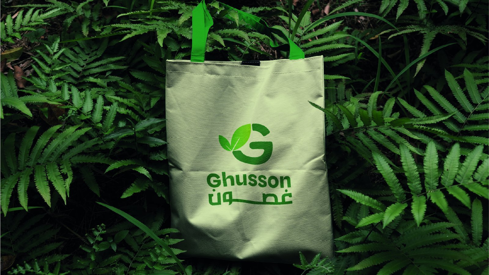
Ghusson — غصون, “branches” in Arabic — sells fresh fruit and vegetables. RX designed a bilingual identity that feels natural and alive: a leaf-shaped G, a fresh green, and Arabic and English lock-ups that sit together naturally on packs, bags and screens.
A name that
grows.
The G mark is drawn as a leaf on a branch — the literal meaning of the name — so the brand reads the same in Arabic and English.
Green leads the palette, with plenty of white space so the colour of the produce itself becomes part of the design.
Bags, packs
and posters.
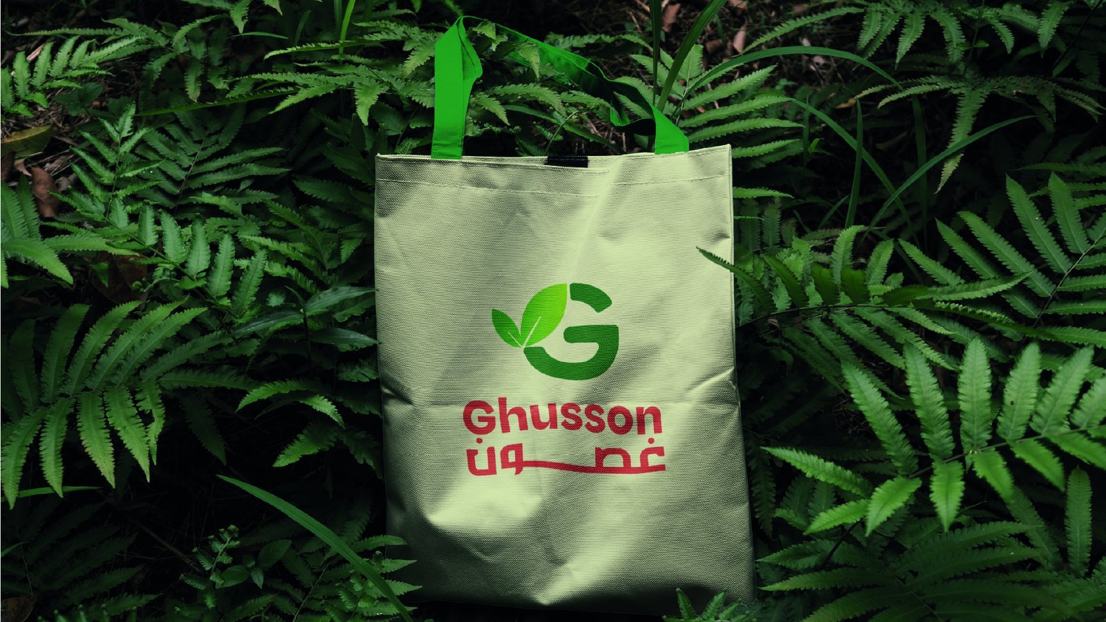
Natural, bilingual,
fresh.
A mark that literally draws the name.
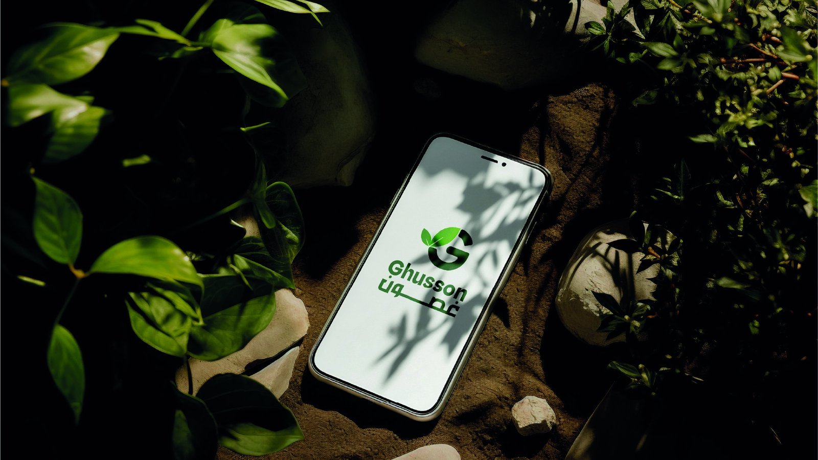
Arabic and English lock-ups designed as equals.
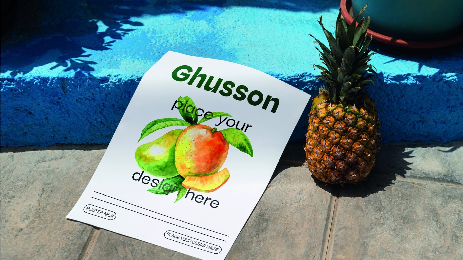
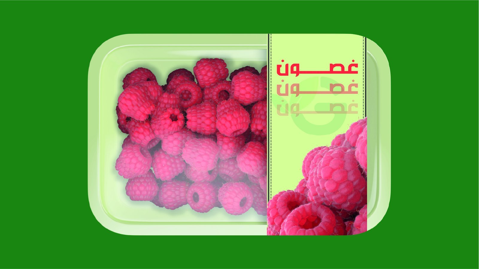
A system that works on packs, bags and social.
Related
reading.
Global templates list the right headings and skip what breaks in the Gulf and Egypt: Arabic rules, signage and fleet specifications, file naming and a named approver for every output.
Read InsightBilingual Arabic-English Identities: What a Proper System Includes"Bilingual" appears in almost every Gulf brand brief and is rarely specified. Here is what a proper Arabic-English identity system includes, and how to check yours.
Read